Open House Hackney
Open House Hackney
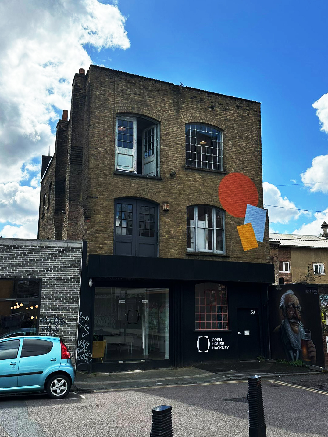
Client: Open House Hackney is a communal house just around the corner of Hackney Wick that can be hired for short term events, exhibits, workshops and parties. At its core stands creativity and community.
Collaborator: Raya van der Kroon
Keywords in order of importance
Community
Openness
Craftsmanship
Architectural
Branding:
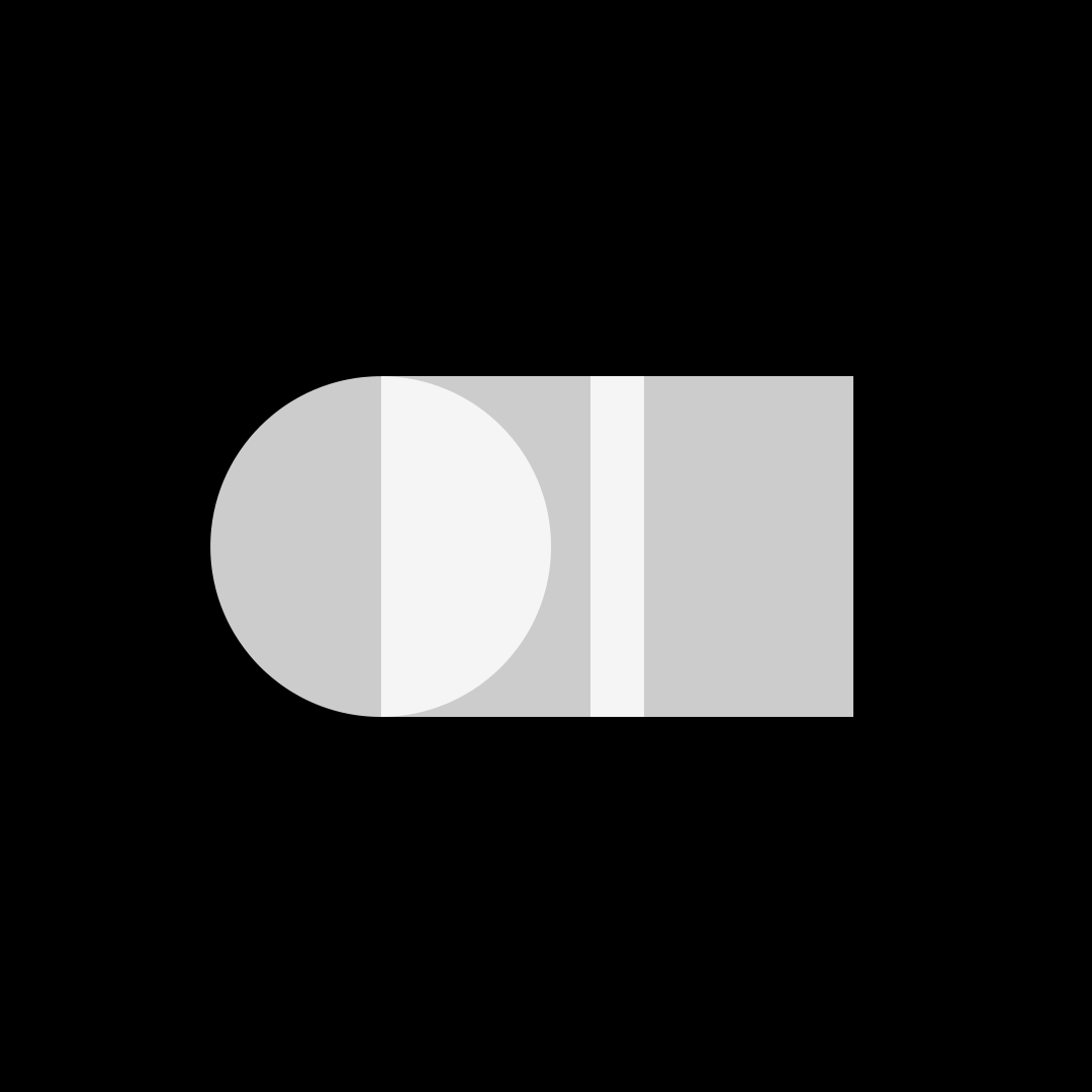
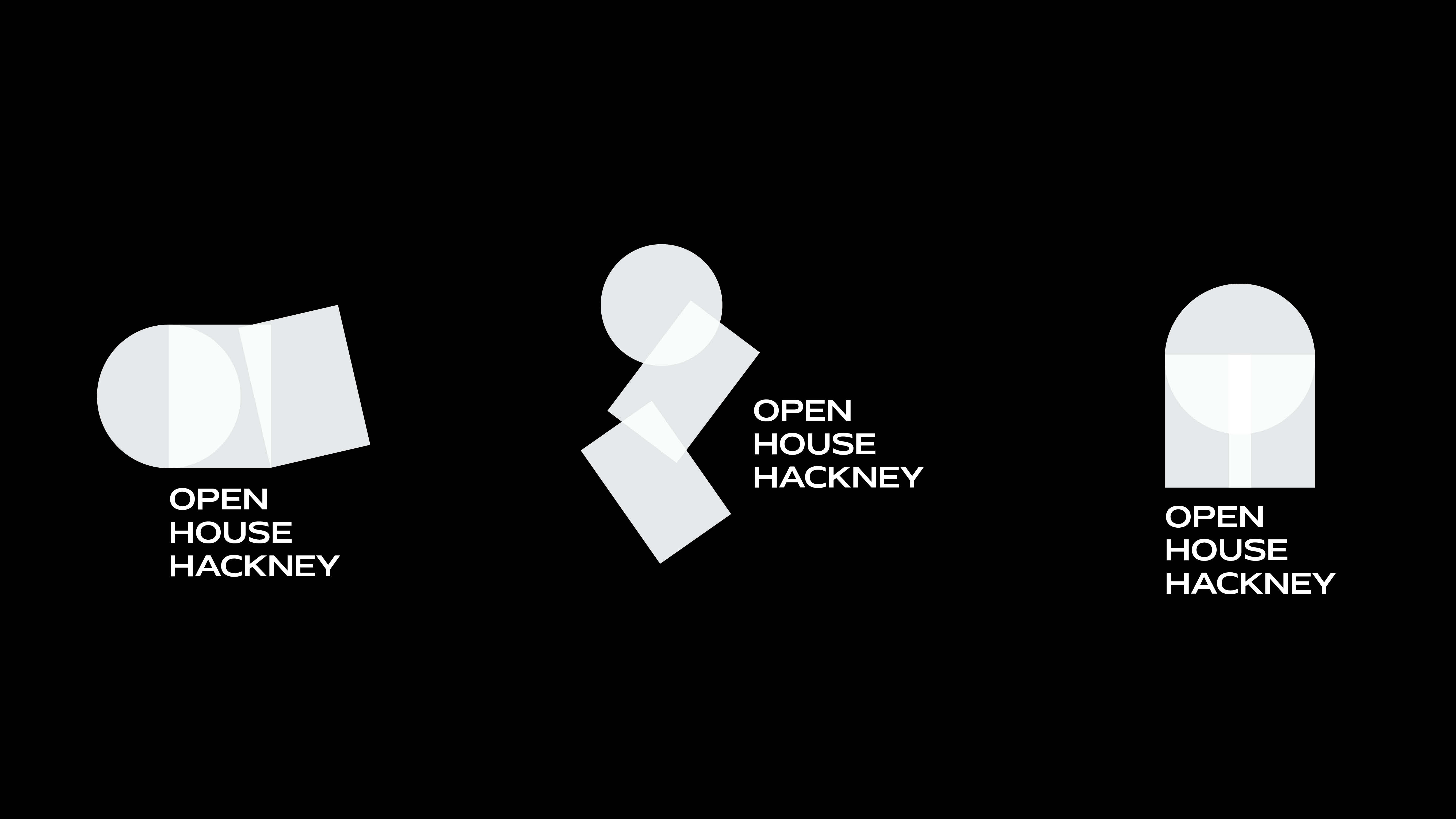
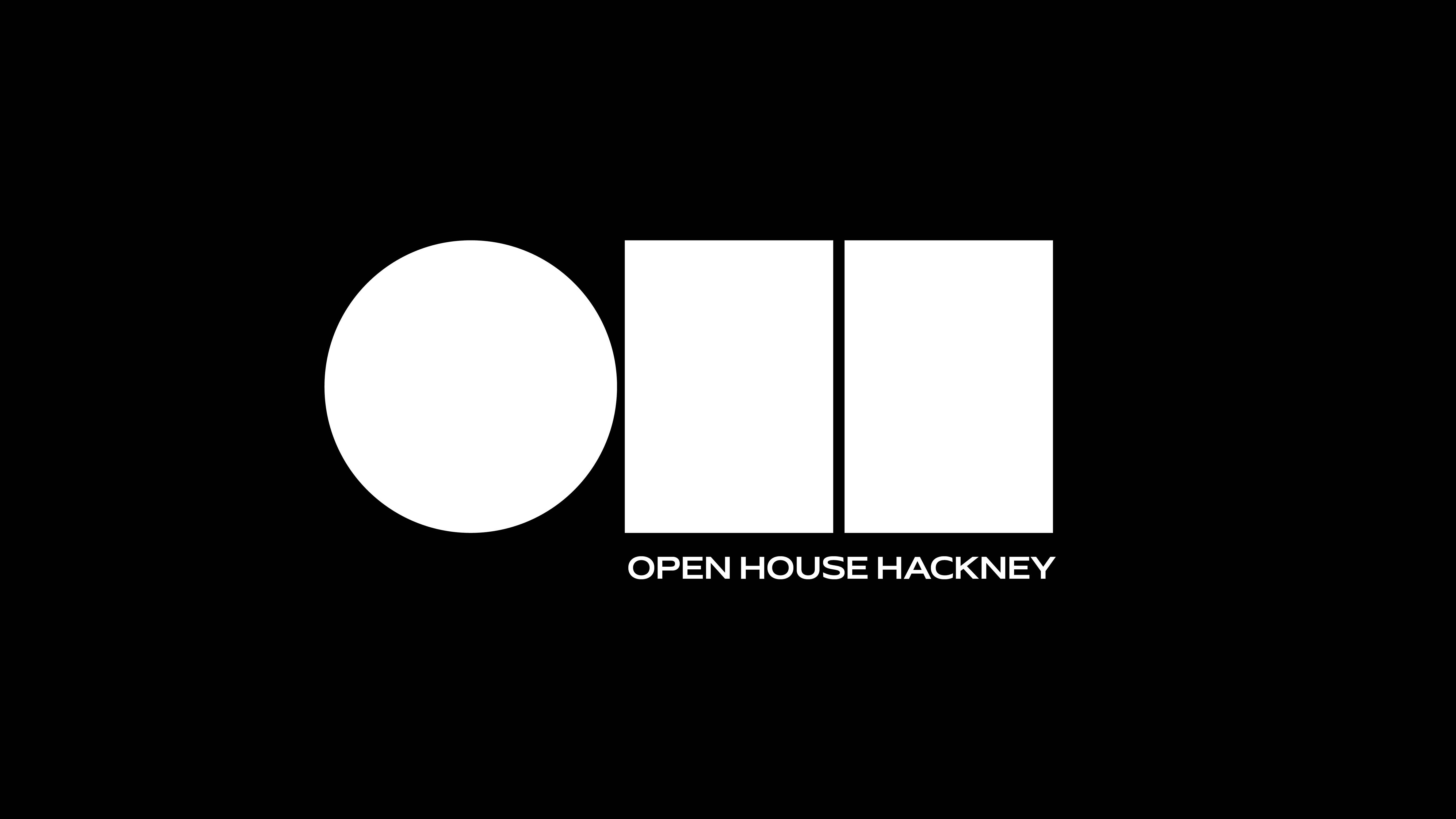
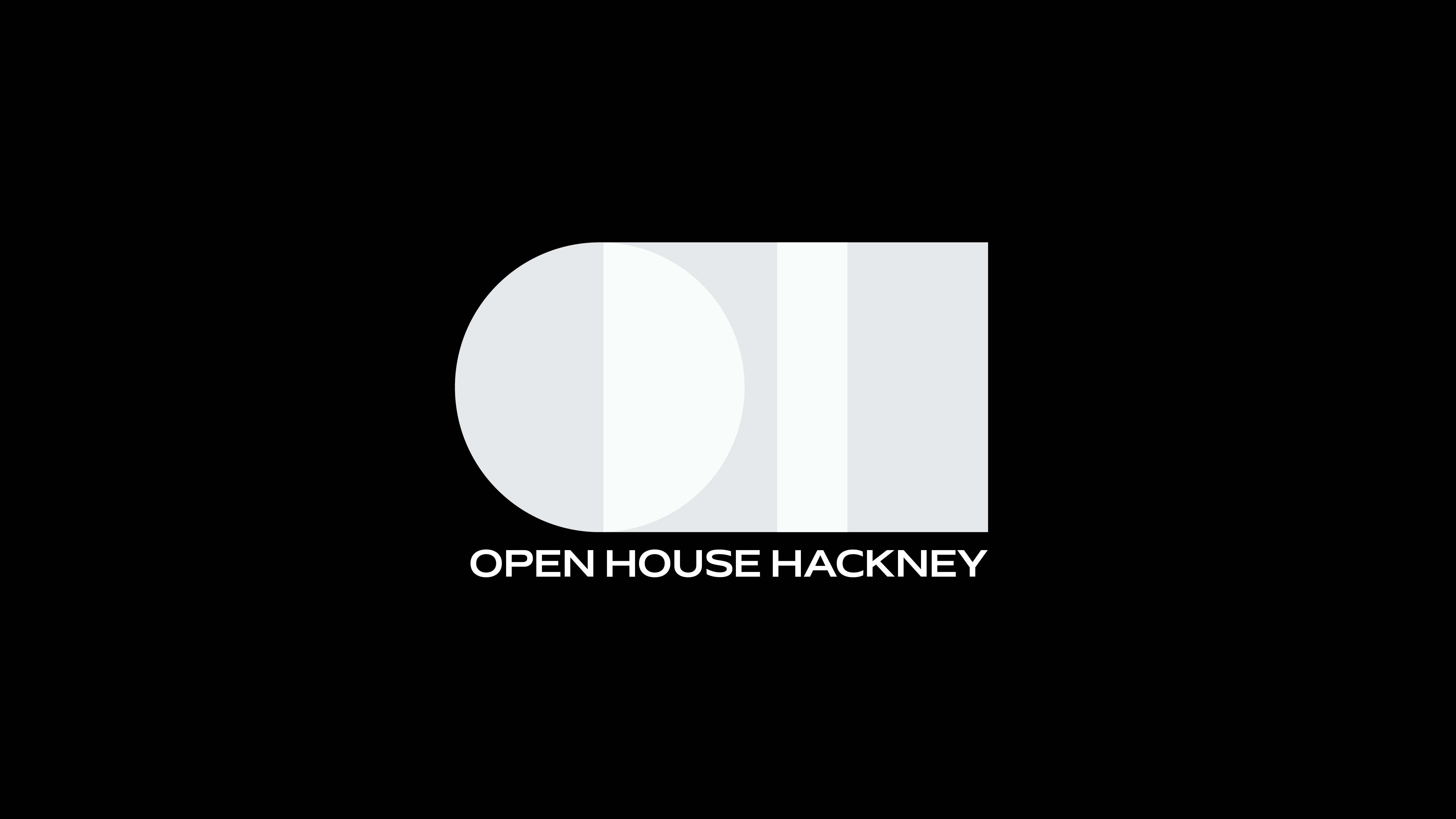
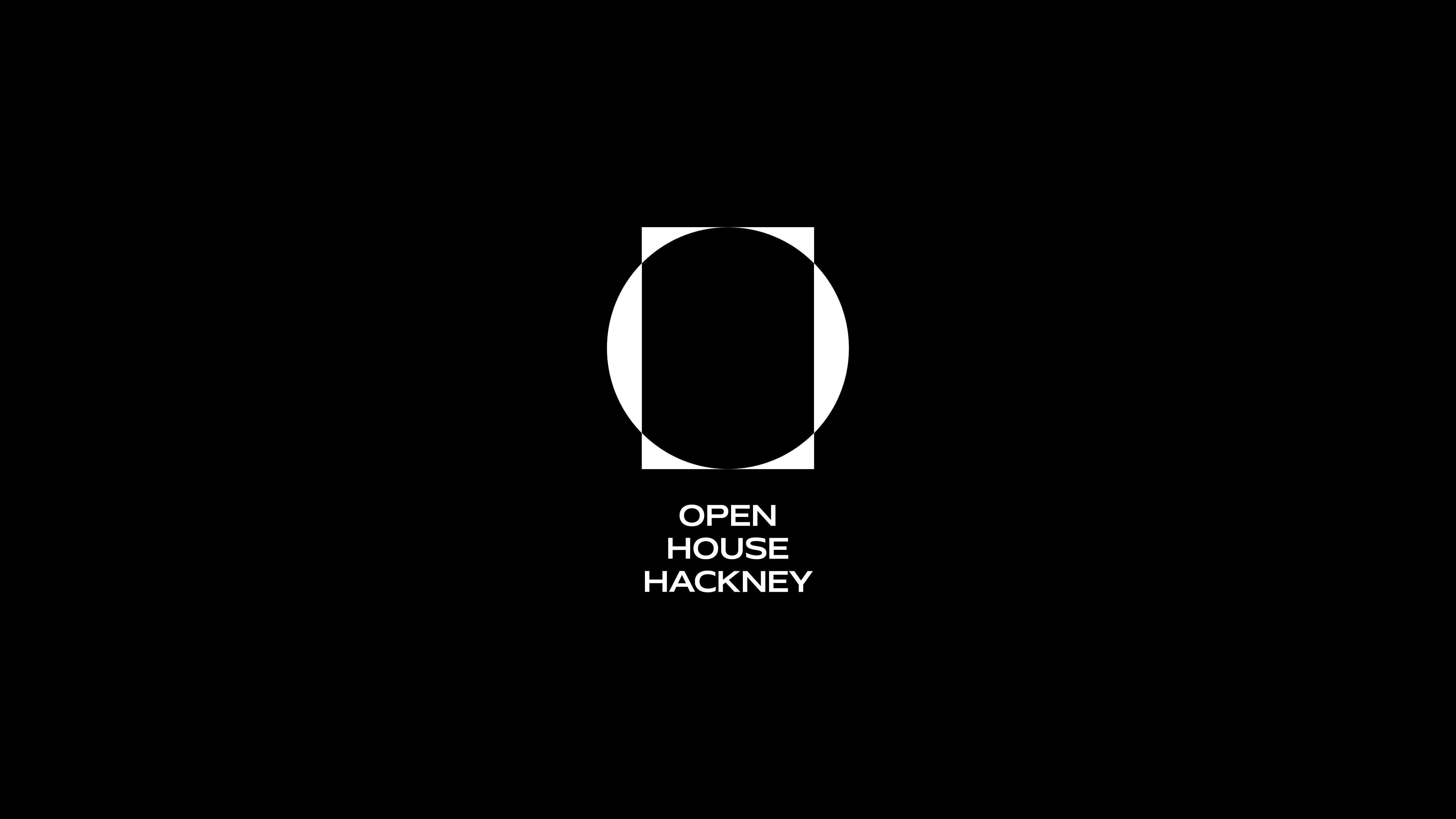
The Logo evolved out of a combination of circular and rectangular shapes that represent the initials OHH (Open House Hackney). This stripped-back approach allows the architectural relevance to come through while leaving room for playfulness and community elements.
The Logo separates into
1. Icon Logo
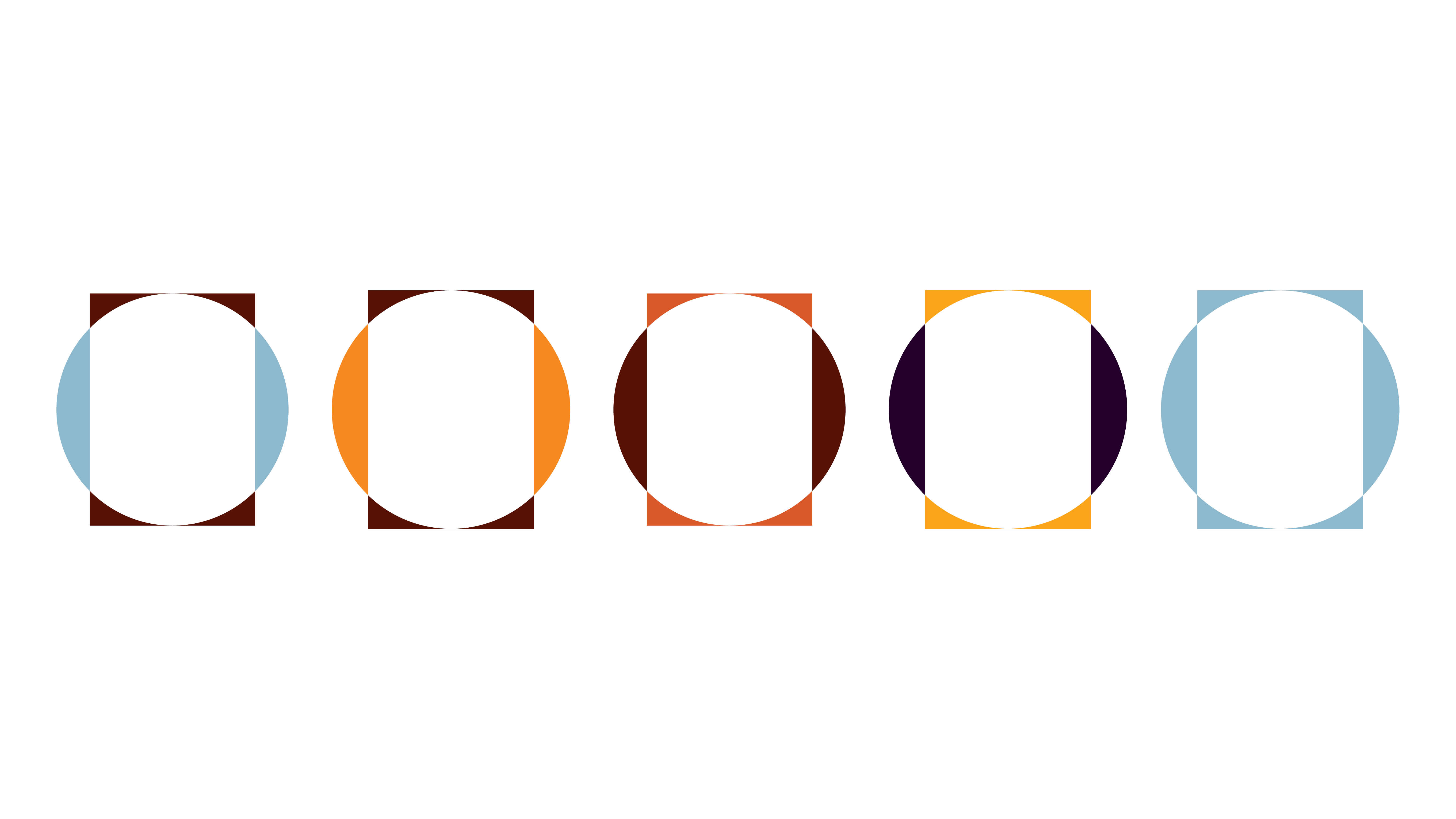
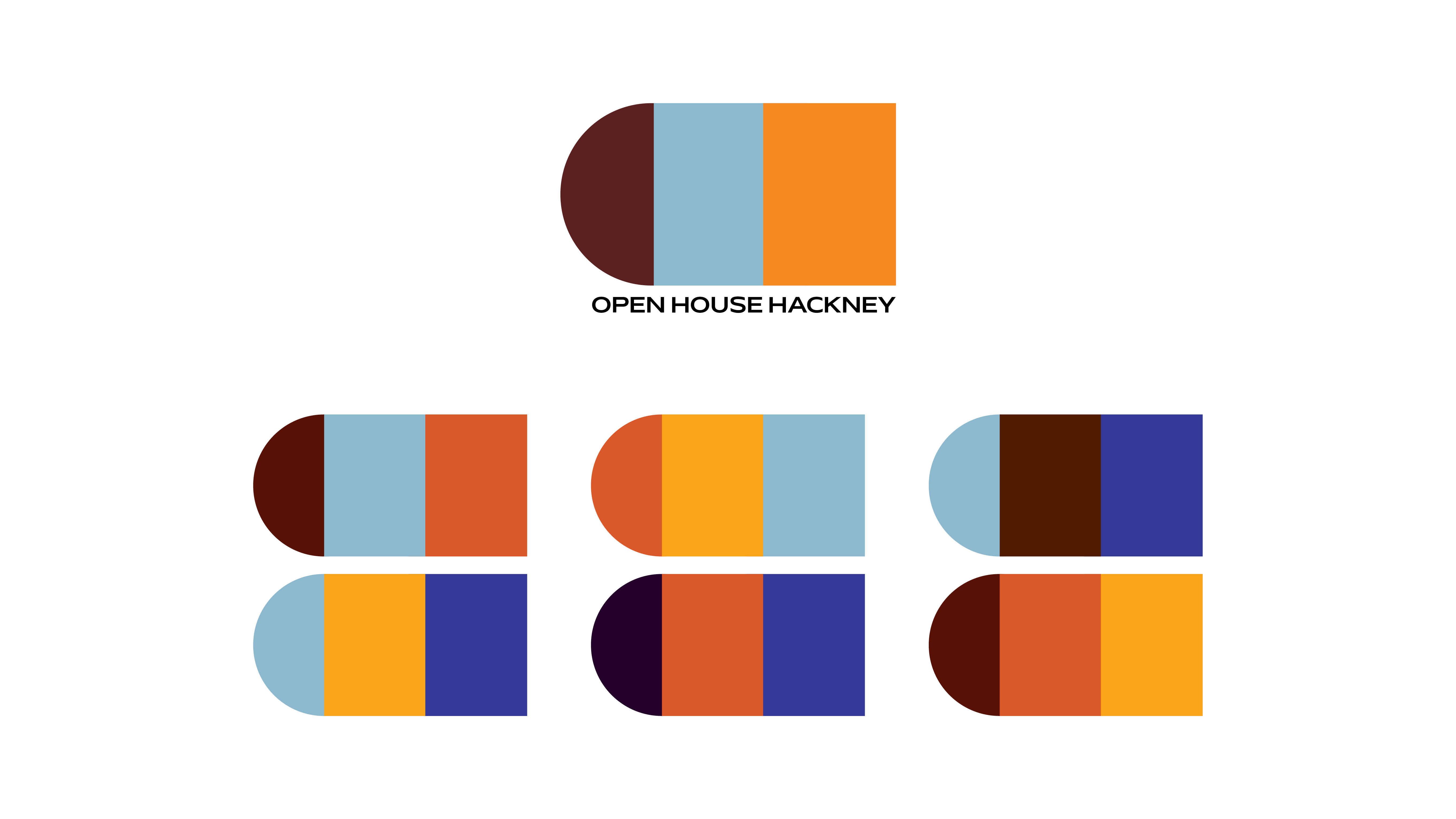
2. Branding Elements
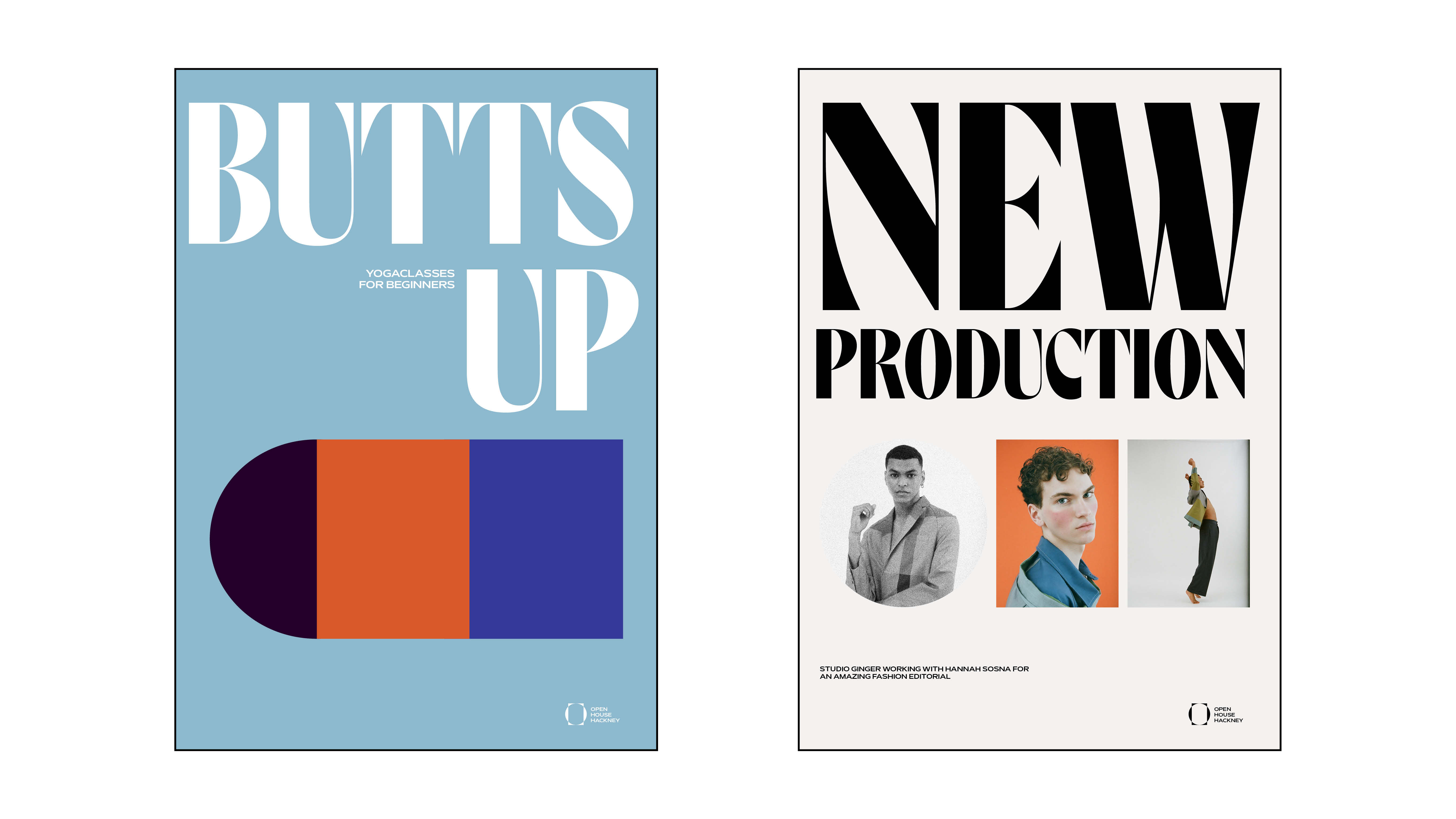
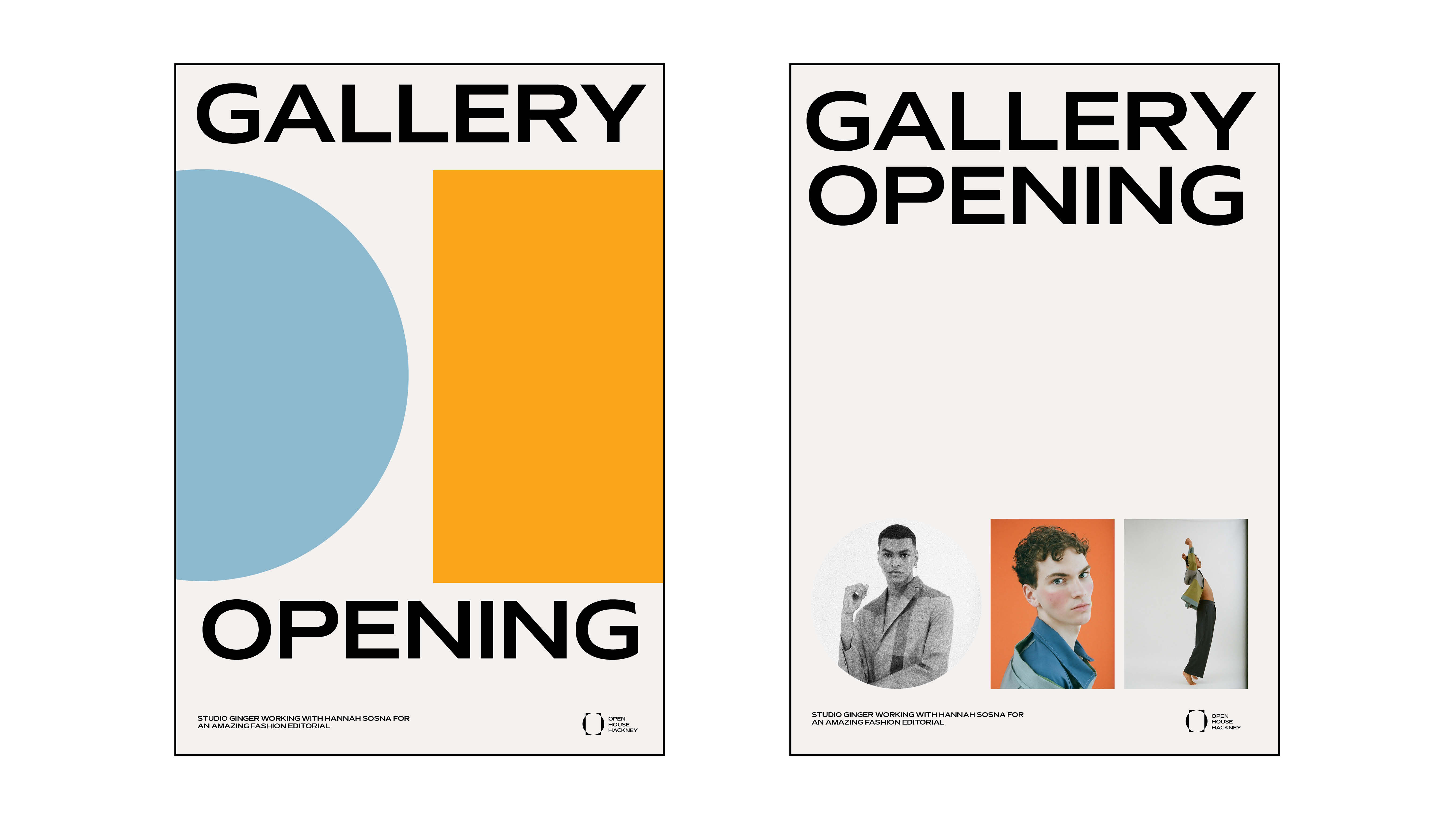
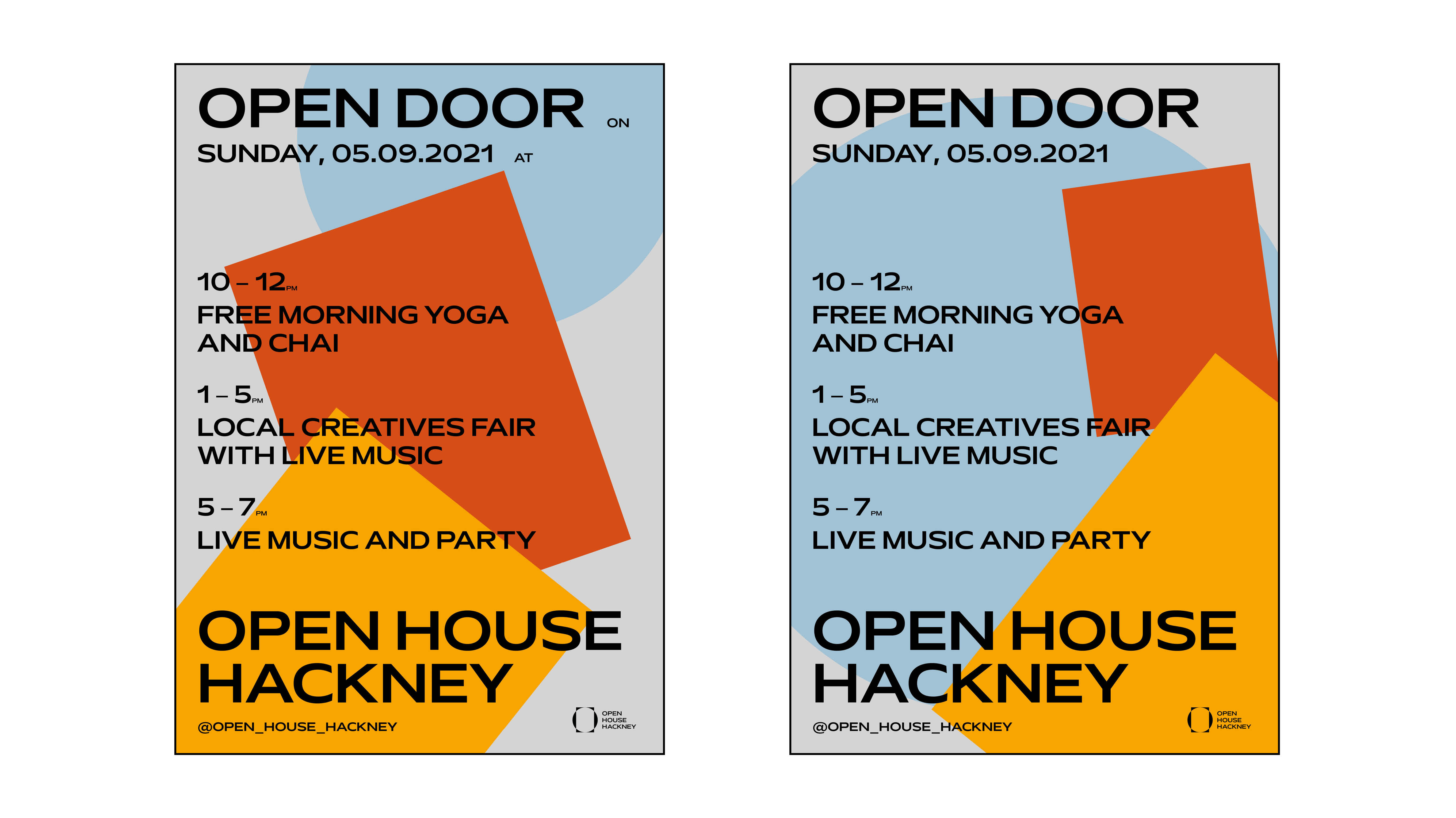
The branding elements are the circle and two rectangular shapes representing the OHH initials. These allow versatility across touchpoints like social media or poster design. By combining these elements in new variations the branding keeps a playful character that caters to the multipurpose usage of the space.
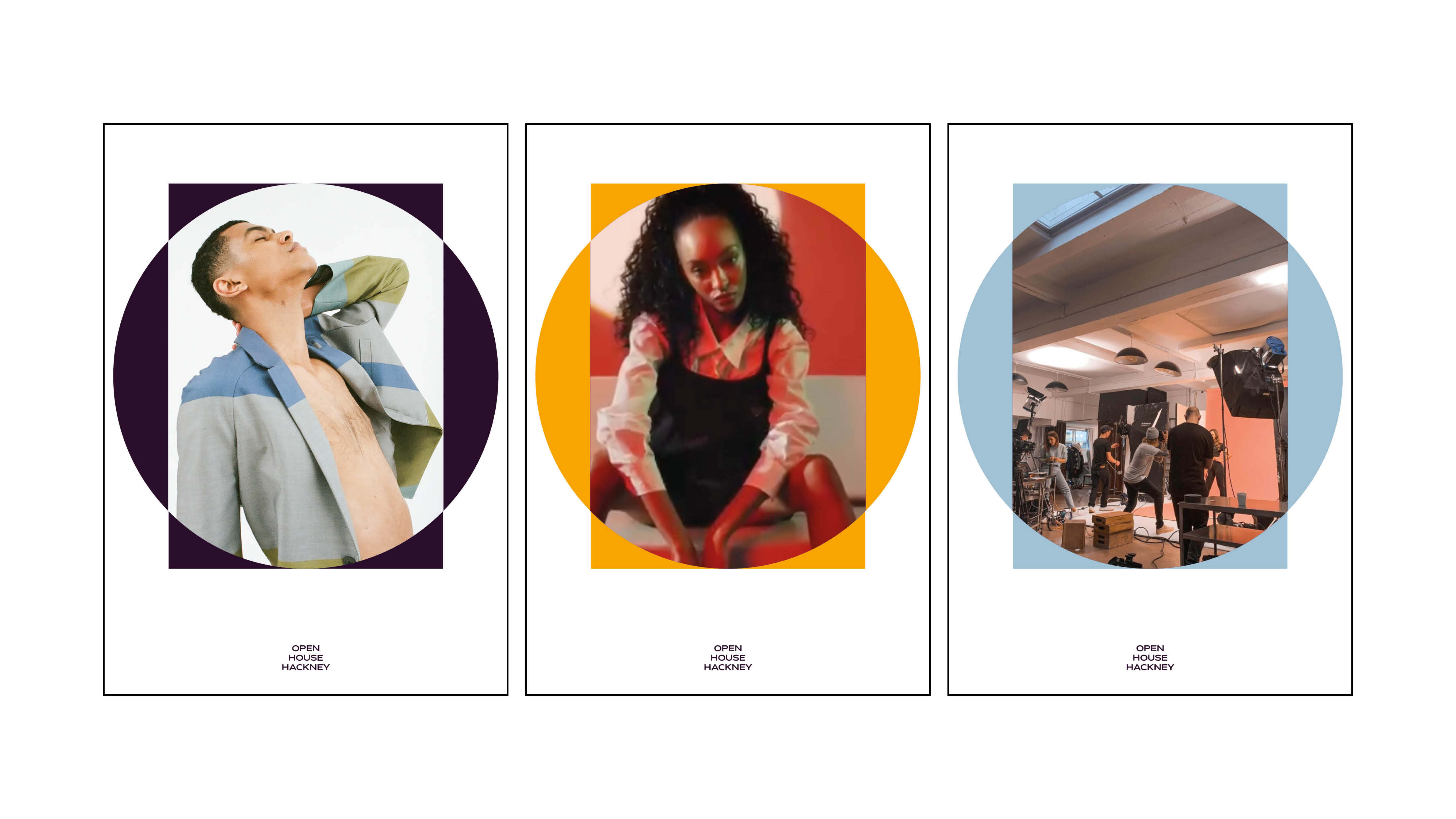
The icon is a combination of these shapes that highlights the openness. Its compact shape allows it to sit comfortably in the digital environment. The central open shape can be kept empty, as well as filled with images of its artists and residents, thus physically and visually becoming part of the brand.
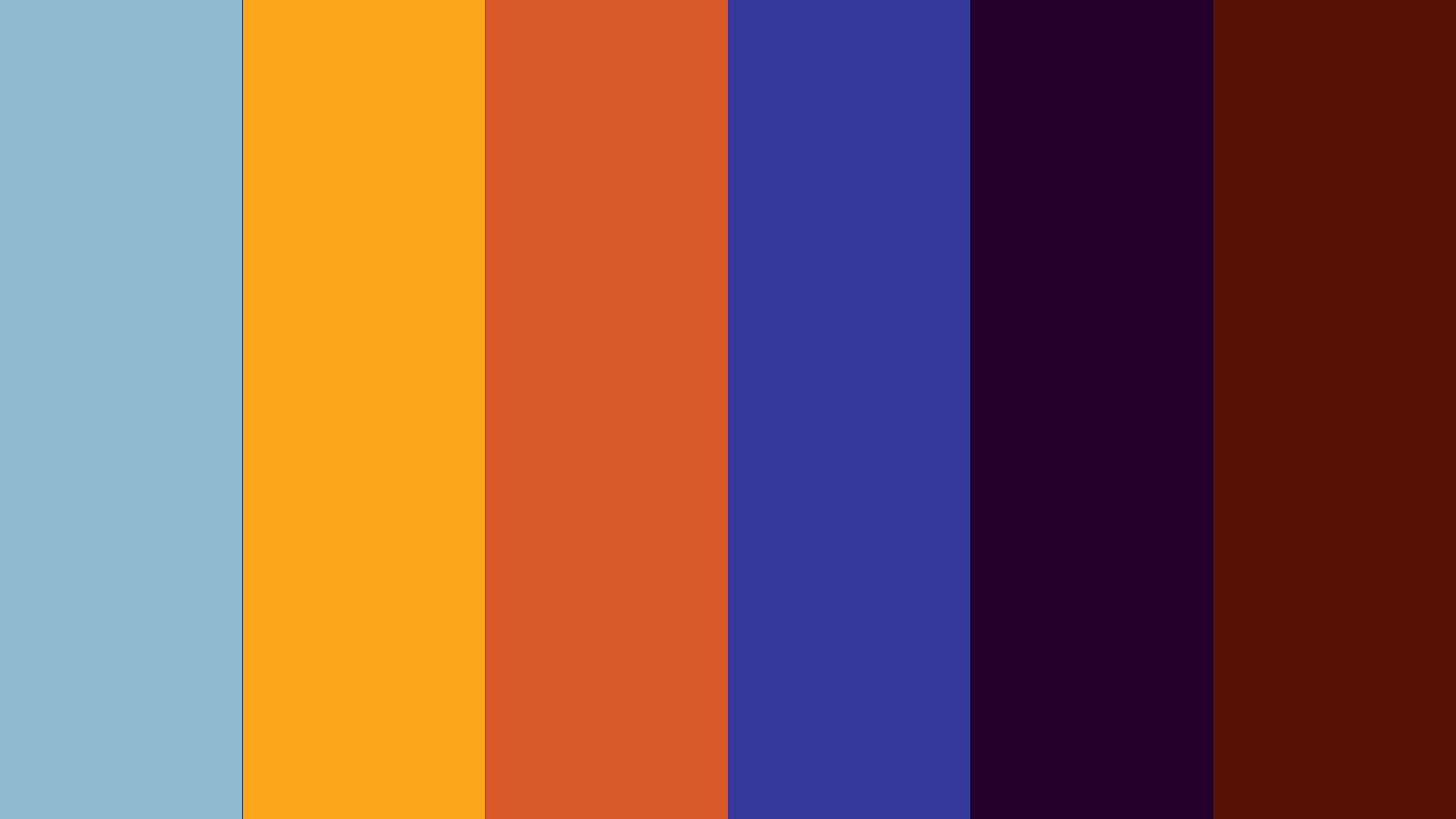
Colours:
The colour palette is inspired by the building and its surroundings. Bricks, concrete, wood, the streets and the sky all played into the creation of a coherent palette that sits well with the context of the building.
Typefaces:
Grotesk - Mattone
for paragraphs, descriptions and secondary headlines
informative
round shape that relates to the logo
Serif/Stencil/Hybrid - Eklektyk
characterful/playful serif
Serifs mirror the icon logo in its dynamic of thick and thinness
Photography of the spaces